Austin Crime
The City of Austin has a lot of data available, including a dataset of all 2.1 million reports filed by the Austin Police Department since 2003 that you can find here.
I enjoy the aesthetics of geospatial data visualizations, so let’s see what we can make from that dataset.
We start by loading the data into a Pandas DataFrame, and removing and renaming the columns we’re interested in:
import pandas as pd

# read csv data
df = pd.read_csv('Crime_Reports.csv')

# we're only interested in these fields
ndf = df[[
  'Highest Offense Description',
  'Latitude',
  'Longitude',
  'Occurred Date Time']].copy()

# ignore any entry containing None or nan
ndf = ndf.dropna()

# rename columns
ndf = ndf.rename(
  columns = {
    'Highest Offense Description' : 'offense',
    'Latitude' : 'lat',
    'Longitude' : 'lon' })
There are 379 types of crimes included in the dataset, ranging from ‘LOITERING IN PUBLIC PARK’ to ‘BEASTIALITY’, so in order to make a useful visualization we need to narrow-down and group some of the types of crimes. I manually categorized most of the crimes into 9 categories: Auto, Assault, Burglary, Domestic, Drugs, Fraud, Misc, Property, and Theft. These categories and their constituent crimes are quite arbitrary, you’re free to use whatever categorization system you want. For the sake of brevity and because it’s boring, I’m not including the code I used to categorize the crimes here, but you can find it in the script on my GitHub. A visualization of the categories I chose and their constituent crimes can be seen below in the Sankey diagram, generated using the Google Charts Service utility. To keep the visualization readable I only included crimes with more than 10,000 occurrences over the last 16 years.
Sankey diagram of crime categories
After the previous step, we now have a DataFrame containing the location, day, year, and categorical crime code, for every incident corresponding to a crime included in my categories. Dropping uncategorized crimes from the dataset reduced the number of incidents from 2.1 million to 1.8 million, which is still still sufficient for cool data visualizations.
A lot of problems can arise when plotting more than 1 million datapoints, but thankfully there’s an amazing Python package called datashader that takes care of everything. I first want to make a plot showing all crimes, regardless of category. Here’s the code I used to generate the following plot:
import datashader as ds
from datashader import transfer_functions as tf
import colorcet

# define latitudinal and longitudinal range for region of interest, and aspect ratio
x_range = x_lb, x_ub = -97.95, -97.5968
y_range = y_lb, y_ub = 30.13, 30.51
ratio = ((y_ub - y_lb) / (x_ub - x_lb))

# set width and height of datashader canvas
plot_width = 1000
plot_height = int(ratio * plot_width)

# initialize datashader canvas
cvs = ds.Canvas(
  plot_width = plot_width,
  plot_height = plot_height,
  x_range = x_range,
  y_range = y_range)

# aggregate data onto datashader canvas
agg = cvs.points(ndf, 'lon', 'lat',)

# rasterize and color canvas data using a transfer function based on
# equally-spaced histogram bins and the colorcet `fire` colormap
img = tf.shade(agg, cmap = colorcet.palette.fire, how='eq_hist')

# export image
ds.utils.export_image(
  img = img,
  filename = 'datashader_all',
  fmt = ".png",
background = 'black')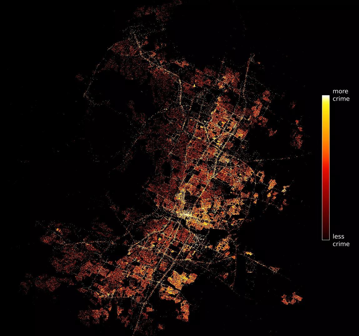 |
|---|
| All crimes |
That looks pretty cool, and it seems to make sense: I doubt any Austinite would be surprised to see that a lot of crimes occur near downtown.
Now we want to color by category rather than intensity. We again use Datashader, but we use a different color palette, and we specify the column of codes in our DataFrame:
# use the first 9 colors of the `Glasbey Light` colormap from the colorcet package
colors = colorcet.palette.glasbey_light[:9]

# initialize datashader canvas
cvs = ds.Canvas(
  plot_width = plot_width,
  plot_height = plot_height,
  x_range = x_range,
  y_range = y_range)

# aggregate data onto datashader canvas, crouping by the column 'code'
agg = cvs.points(nndf, 'lon', 'lat', ds.count_cat('code'))

# rasterize and color canvas data using a transfer function based on
# the list of colors we defined
img = tf.shade(
  agg,
  color_key = colors)

# export image
ds.utils.export_image(
  img = img,
  filename = 'datashader_by_category_black',
  fmt = ".png",
background = 'black')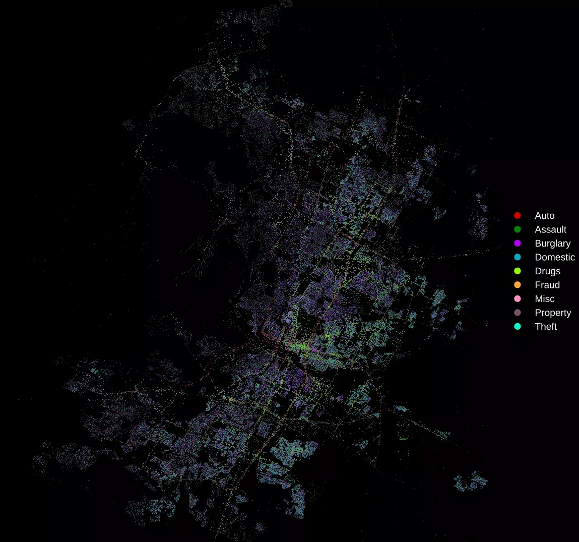 |
|---|
| Crimes by category |
It looks like there are a lot of drug and alcohol crimes occurring in the East 6th Street area, which is completely unsurprising. Most of the auto crimes occur along major roads and highways, again unsurprising.
Let’s look at each of the nine categories a bit more closely. We start by generating plots for each category:
for code in range(9):

  # initialize datashader canvas
  cvs = ds.Canvas(
    plot_width = plot_width,
    plot_height = plot_height,
    x_range = x_range,
    y_range = y_range)

  # aggregate data onto datashader canvas, crouping by the column 'code'
  agg = cvs.points(nndf[nndf['code'] == code], 'lon', 'lat', ds.count_cat('code'))

  # rasterize and color canvas data using a transfer function based on
  # the list of colors we defined
  img = tf.shade(
    agg,
    color_key = colors)

  # export image
  ds.utils.export_image(
    img = img,
    filename = 'datashader_by_category/code={code}',
    fmt = ".png",
    background = 'black')
and then tile them together using ImageMagick:
montage code=*.png -tile 3x -geometry +0+0 tile.png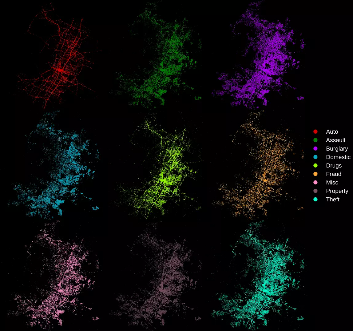 |
|---|
| Crimes category, separated |
