Fascist Forge Reactions
This is the second post in a series focusing on the collection and analysis of data from a militant neo-Nazi website, FascistForge.com. You can see the first installment here
Just like how Facebook allows its users to “react” to posts and comments using emojis, Fascist Forge (FF) allows its users to do the same, except that all of the FF emojis are Nazi-related. I’ve listed them below, and included explanations for the more obscure:
 Like
Like
 Gas
Gas
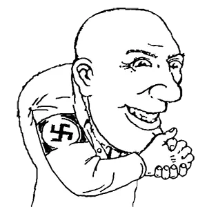
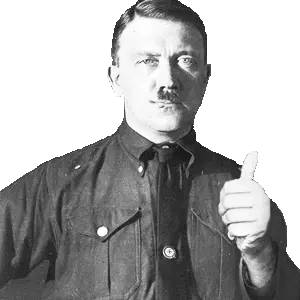 Hitler Approves
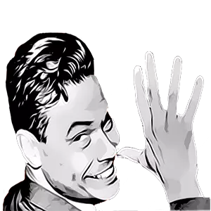
 Mason +1 (James Mason, author of SIEGE)
 Rockwell Salute (George Lincoln Rockwell, founder of American Nazi Party)
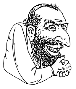 Shlomo
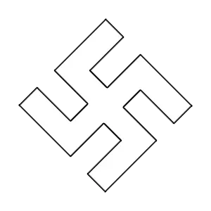
 Sneaky Nazi
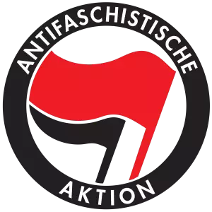 Anti-Fascist
Just as in the previous post, I wrote a small script based on Selenium and BeautifulSoup and extracted data for all reactions on the website. You can find the script in the scripts page of the GitHub Repo.
Below is a bar chart showing the frequency at which the different reactions occur:

“Likes” comprise about 82% of the total reactions. Let’s look a bit closer into how likes are distributed amongst the userbase. The image below shows the rank-size distribution for the likes received and likes given for all users with more than zero likes given or more than zero likes received. This is consistent with what we saw in the previous post: most of the 1150 or so users are lurkers and haven’t liked a single post or had a single post of theirs liked,
![]()
We’ll focus for now on the users with more than zero likes given and more than zero likes received. The scatter plot below shows the number of likes given vs. number of likes received, plotted on a log-log scale because of the large variations in magnitude for these quantities:

The distribution is fairly proportional, I was expecting it to be more unequal. Looking at the ratio of likes received to likes given, we see a similar result: the distribution of the like ratio is symmetric on a logarithmic scale, centered about 1.

On one end of the distributions, there are a few users who like other comments 11 times more often than their comments get liked, and on the other end, there are a similar number of users who get their comments liked about 11 times more often than they like other comments.
Time for some fun, let’s map out the network structure of liked in FF. I won’t go in-depth regarding how I generated the graphs below, you can read the details in the “like_network_graph.py” script in the plots directory on my GitHub. I used the Python packages HoloViews and Bokeh to generate the interactive visualization. I’ve found HoloViews difficult to use because of the lack of comprehensive documentation, but it can generate some very cool visualizations if you take the time to get it right. The steps for generating the visualization were:
- Remove entries from the reactions DataFrame if the user did not have at least one like given and at least one like received. This was to make sure the graph visualization looked good and didn’t have any dangling nodes.
- Use networkx to calculate node positions of the graph based on the edge weights.
- Format data into a structure HoloViews can understand
- Initialize Graph using HoloViews, save html file using Bokeh backend.
Here’s the code I used for step 3, in which edf and ndf are DataFrames containing edge and node data respectively, and 'log degree' is a column in the node DataFrame containing the base-10 logarithm of the sum of likes given and likes received:
import holoviews as hv
hv.extension('bokeh')
renderer = hv.renderer('bokeh')

# construct Holoviews graph with Bokeh backend
hv_nodes = hv.Nodes(ndf).sort()
hv_graph = hv.Graph((edf, hv_nodes))
hv_graph.opts(
  node_color = 'log degree',
  node_size=10,
  edge_line_width=1,
  node_line_color='gray',
  edge_hover_line_color = '#DF0000')

# save html of interactive visualizations
renderer.save(hv_graph, 'graph')
I’ve colored the nodes by the log of their degree (number of likes given + number of likes received) using the default viridis colormap. The resulting visualization is shown below:
So that’s pretty cool, but there are a lot of edges, which makes it difficult to see the graph’s structure, especially in the middle region where the nodes are close together. Luckily, HoloViews has an edge bundling feature. For more information about edge bundling, see these resources. The extra code needed to bundle the graph edges is shown below:
from holoviews.operation.datashader import bundle_graph

# bundle edges for aesthetics
bundled = bundle_graph(hv_graph)
The resulting visualization is shown below. I think it looks a lot better, both aesthetically and informationally:
The graph shows that there is a relatively small group of users who are responsible for a large percentage of all reactions. The table below shows the top 10 users:
| Username | Likes Received | Likes Given |
|---|---|---|
| Nox Aeternus | 331 | 312 |
| Mathias | 216 | 256 |
| Scythian | 192 | 262 |
| Yorkie | 138 | 194 |
| Pugna | 130 | 146 |
| Reaper | 116 | 156 |
| D. Aquillius | 94 | 110 |
| Dakov | 144 | 49 |
| Pestilence | 117 | 76 |
| Gigaboltro | 101 | 90 |
