Austin Sprawl
This post is similar to my previous post: a quick visualization of a large geospatial dataset provided by the City of Austin. This time I’m looking at Austin’s permit data over the last 38 years. You can download the dataset here, it has nearly 2 million rows and 68 columns. You can find the script I used to generate the visualizations in this post here. We’re only really interested in the latitude, longitude, year, and permit type, so we read in the data from the CSV file we download and extract the relevant columns:
import pandas as pd

df = pd.read_csv('Issued_Construction_Permits.csv')

ndf = df[[
    'Calendar Year Issued',
    'Latitude',
    'Longitude',
    'Work Class' ]]
Now we loop through all years and plot all new permits (permits issued for new buildings) before the given year, colored by year:
import matplotlib.pyplot as plt
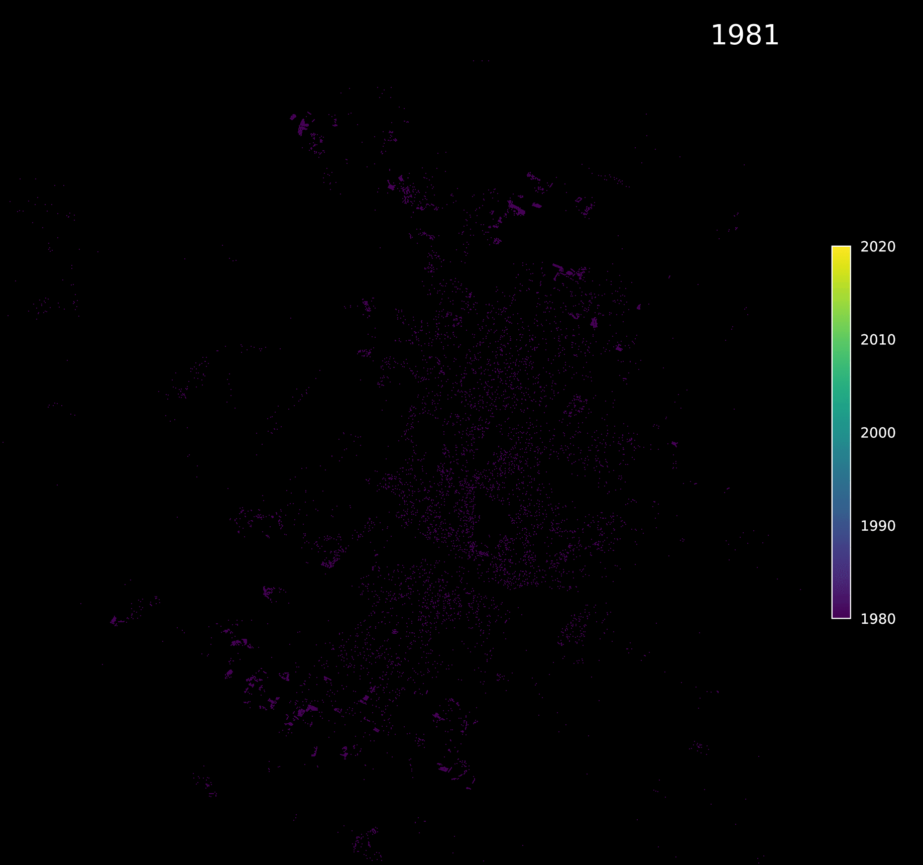
for superyear in range( 1981, 2018):
# initialize figure with correct aspect ratio
fig, ax = plt.subplots(figsize = (8, 8 * ratio))
# set background color to black
ax.set_facecolor('k')
# loop over all years before superyear
for year in range(superyear, 1980, -1):
# convert year to index between 0 and 1, for colormap
color_idx = (year - 1981) / float(2018 - 1981)
# get latitude and longitude of all new permits in the given year
lats = ndf[
((ndf['Calendar Year Issued'] == year) &
(ndf['Work Class'] == 'New'))]['Latitude']
lons = ndf[(
(ndf['Calendar Year Issued'] == year) &
(ndf['Work Class'] == 'New'))]['Longitude']
# plot latitude and longitude
ax.scatter(
lons,
lats,
s = 0.15,
linewidth = 0,
facecolor = cmap(color_idx),
marker = ',')
# draw year in upper right corner
ax.text(
x_ub-0.01,
y_ub-0.01,
str(superyear),
fontsize = 20,
color = 'w',
ha = 'right',
va = 'top')
# set latitude and longitude limits
ax.set_xlim(x_range)
ax.set_ylim(y_range)
plt.subplots_adjust(0,0,1,1)
# save figure
plt.savefig(f'new_permits_all_years/{superyear}.png', dpi = 200)
plt.close()Converting all images into a single gif using the ImageMagick bash command:
convert *.png -delay 0 -loop 0 sprawl.gifand performing some optimizations to reduce the file size, results in the following:
 |
|---|
| New permits by year |
We see that Austin’s borders have expanded significantly in the last nearly 40 years, commonly referred to as urban sprawl. The plots using all permits tells a similar story as the plots using only new permits: below shows plots for all permits in 1981 compared to 2018:
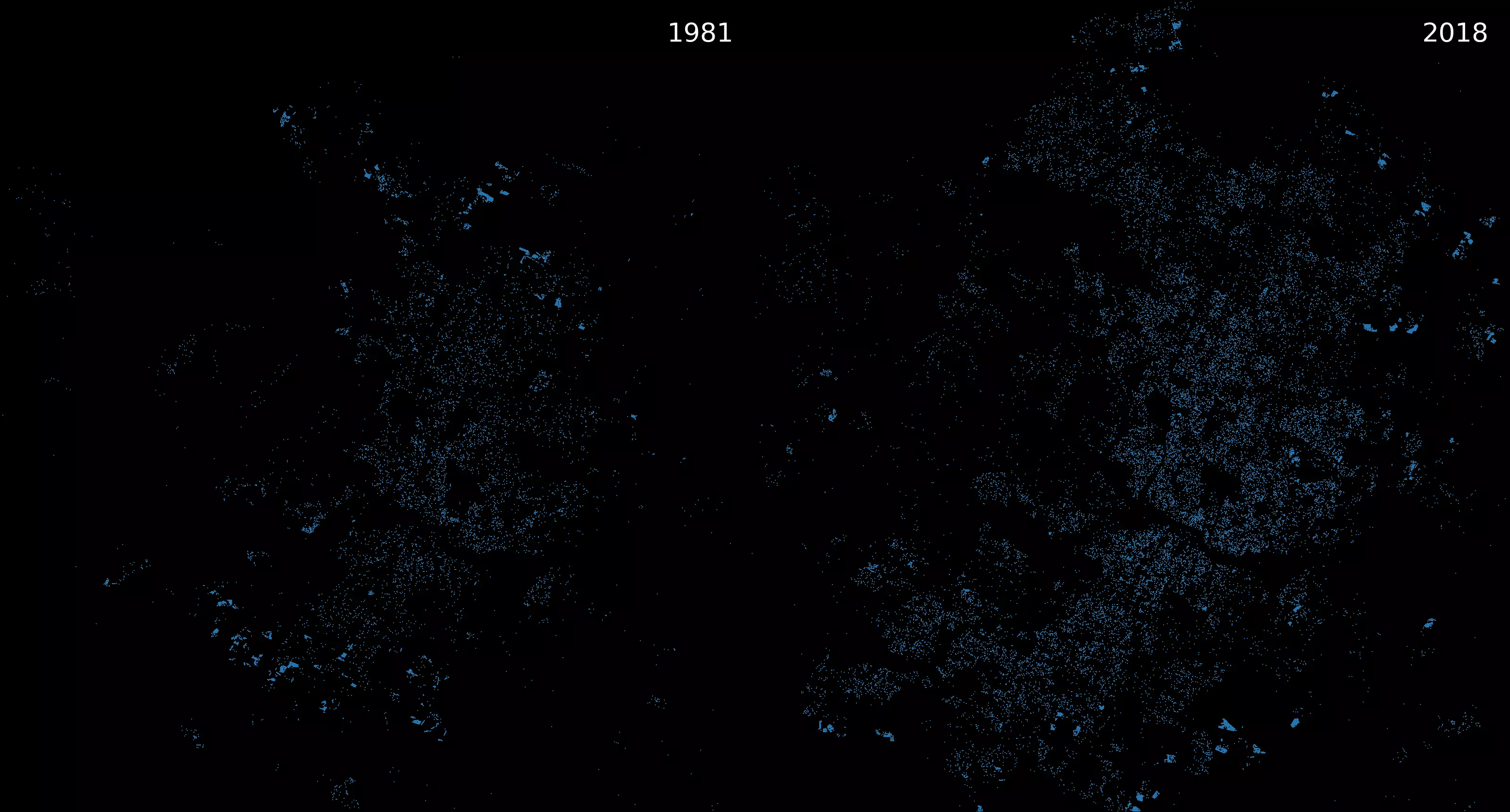 |
|---|
| All permits issued in 1981 vs. 2018 |
The data is all consistent with this New York Times story, which shows that Austin is among the worst cities in terms of urban sprawl; between 2010 and 2017 Austin decreased in average neighborhood density by 5% despite growing by nearly 20% over the same time period.
